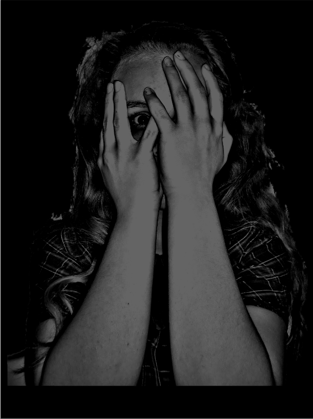
Friday, 9 May 2014

Adding in actor names

I am now moving on to adding in my actors names into the trailer. Due to deleting some of the sounds I used when editing my trailer, I won't be able to edit the high quality, un-exported version any further. Therefore, I will have to upload my lesser quality exported version, and split it/ add in text where I need it. Due to this, there are limits as to where I can put in the text because I don't want to unsynchronise any sound or affect the quality of my trailer how it is.

I have decided to add in the new text in parts where the actors are actually still moving. I will also add it in less interesting parts, and hopefully quite evenly between the three black backgrounded text that I already have.

Font:
In terms of actual font I was stuck between two:


At first I wasn't sure which font I wanted, so I tried putting on the 'glow' in animation to match the other text in the trailer. After doing this, I chose the font in the second picture because I feel as though it just looked a lot more professional. Particularly in the second part of the trailer.


Colour:
 I wanted to use white because:
  • I have already tried it and it works
  • It matches the rest of my trailer text
However, the white doesn't show up very well without a black background. Therefore, I will need to try out some new colours. I don't want to use black because I feel it will contrast the white too much and also it is too boring. Therefore, I will try red because research with my poster showed me that red is a colour often associated with horror films.


I actually ended up liking this a lot more than expected, and it went really well with the 'glow' effect:


Therefore, I kept the red. 
I decided that I wasn't gonna add in the production company logo because:
  • it was too difficult with a continuous already exported film
  • I have researched other trailers which don't include one so I don't feel it is necessary
  • It ruins the timing of my music and sound which I spent a long time on


Thursday, 8 May 2014

Poster improvements


I have added in the bbfc rating and my production company logo to make my poster look more professional.
I then added in a "coming soon". This is my fully improved poster:


Issues with the logo

After trying to put my logo onto my poster, I have realised that the text is too small. Therefore I edited it again, adding in different text in a different font and played with the colours slightly.

Wednesday, 7 May 2014

Production company logo

I already have a production company name, and so it shouldn't be too difficult to work from this to create a logo. My already existing name is "Jittershack Productions". Connotations of the word shack consist of house, building. I all try to find a black plain cartoon style house.


I liked the two highlighted ones the most. Although I preferred the first one, the second one is more plain and will allow me to do more things with it. Also, the second one has writing on it and the first one has a transparent background.

In terms of colour the logo has to be neutral (black, white, grey). It can't be white because the windows won't show, and it can't be black because it will fade into my background too much.

Other colours I use will include red, and obviously black for the background.

This was my finished product.


Improvements to be made

As a result of my teacher's feedback, I have got some improvements to make to my poster and trailer.

Trailer
- need to add in actor names
- need to add in institutional information (a production company logo)

Poster
- need to add in production company logo
- bbfc rating

It makes sense then, to start creating a production company logo.

Thursday, 1 May 2014

Final magazine cover


Imrpoving text and final touches

Even though I knew my text had to be more professional looking, I still wanted it to be fairly chunky, so that it still stands out to the audience, and connotes gruesome horror films. 

First, I chose the "Bolts SF" font, which I applied to all my text apart from the title:


I felt as though now my magazine cover was too drowned in text. Therefore, I decided to change the less important text into a different font in order to not overpower the magazine cover with text, and to symbolize which information is the most relevant.

I chose a font called "Diamond Heavy SF" for the minor parts of anchorage text:


I now feel as though the text suits my magazine, has character to it, and doesn't drown out other elements of my magazine cover.

I will ask for feed back from my teacher to see if there are any final touches which could make my magazine cover any better. 


Improving the banner


Wednesday, 30 April 2014

Adding in a banner


I added in a banner and instantly knew that I didn't feel as though it fitted. I now feel as though there is too much yellow on the page, and I need to reduce that in order to highlight the really important information (hopefully just the bits that use buzz-words). 

I also asked my teacher's advice on the banner and she remarked that it didn't look professional enough. She suggested that the text font was also too simple, which I already knew but it was good to get confirmation. She also said that I should maybe create a sort of outline for the banner to make it look more professional.

From my own reflection the banner is too straight and boring. I need to add some character to it.

Improvements


Although this looks a lot better, the text still looks a little bit simple and there is a lot of free unused space. I have asked my teacher what I can do to fix this and she has advised me to put in a banner at the bottom to ensure I have used my space effectively and have made my magazine cover look more professional. 

The rest of the text


Colours
In terms of the colour I feel that the text is just as effective as I wanted. I like the contrast between blue and red which symbolises the importance of each piece of text.

Font
I like the look of the text because it is big and bold but something about it still seems quite simple in terms of font.

I need to put in my final touches such as the barcode and highlights and see what I think of it then.

Tuesday, 29 April 2014

Title colour

I knew from the start due to my existing magazine research that I wanted to use red text for the bulk of my magazine cover text due to the bright standing out colour, but also due to the fact that it connotes horror. However, which type of red do I want to use? A deep red, or a more true red?


I chose the deeper red because it seemed to just 'go' better with the overall theme of the magazine cover.


Monday, 28 April 2014

Text font

The text is possibly the most important part of a magazine cover, or one of them at least. Therefore, I want to spend a sufficient amount of time on it - choosing the right colours, and making it look professional. I noticed the text tool on PhotoPlus which I couldn't find when doing my poster, and tried using it. However, I found it a lot more difficult on here and there were less options to customise the font. Therefore I returned to PagePlus to insert my text.

The first step to do is choose a font. These are the ones that I need to choose from:


I really like this font because it is big and bold but also looks sort of different at the same time. It has a 'magazine-y' feel to it but I also feel as though it suits a horror movie.


This one is appropriate for a magazine but doesn't really represent horror in the way that I want it to.


I really like this one because it is really big and bold but it just doesn't have the same feel as the other text and doesn't attract me quite as much.


The background

Initially I planned to take away the background and put in another plain background, however, I have decided that I actually quite like the background how it is. The off-white colour due to the "Sapphire" effect that I earlier put in is a similar colour to the actor's face which adds to her character and adds to the general effect of the poster overall.

However, it would be better for me to cut out the bottom because the radiator is visible and this takes away from the effect. To do this I simply used the crop tool and selected the part of the picture that I wanted to keep.


The result of this:


Editing the photo further

The 'Sapphire' effect made the picture look a lot better than original, but it is still not to the standard that I'd like it. My attention was draw to this side bar where I increased the exposure, brightness and contrast slightly to get the desired effect.


The result of this was as follows:


Starting the actual magazine cover!

To start the magazine cover, I need to first edit my photos like I did with my poster raw pictures. Because of the knowledge I have now gained from creating my poster, I knew where to go when starting. I opened up Serif PhotoPlus X5 and imported my picture. I then clicked on the 'Photo Fix' option.

There I tried out all the effects as I did before, and chose two that I really liked:

"Sapphire":


 "Glamour":


Both of these effects improved the quality of the photo, but the glamour effect made it look too 'normal' whereas the sapphire effect made the photo seem more like somebody out of a horror movie. This is due to the eerie colours used such as purples and greys. 


Sunday, 27 April 2014

Magazine cover first sketch


Things I've learnt about magazine covers

Through my research there are a few things that I have noticed that run commonly through every (film) magazine cover. These things consist of:


  • The title is always the brightest/one of the brightest things on the page, featuring bright(er) colours
  • In horror film magazine covers particularly I've noticed that the main image is usually of the antagonist rather than the protagonist
  • There is usually quite little writing around the outside, and the parts that do include buzz-words and only use really relevant information
With this information I can now go on to creating my first rough sketch of my poster.


Film magazine name/title!


Target Audience analysis

The predominant gender which purchase and are fans of film magazines, are male. However, who's to say that some film magazines aren't aimed at females/don't contain elements which could attract females rather than males deliberately or non-deliberately?

An example of such things is the -previously posted about- already annotated "Paracinema". The cover of the issue that I annotated states that all the articles inside were written by women and that it is an "ALL WOMEN'S ISSUE".  Statement's like these are likely to put many male readers off purchasing this issue. However, there are still elements of the cover which are more likely to attract male readers, such as the colours used. The dark colours in most film magazine covers are a device to attract male readers, and "Paracinema" have included this device in their "ALL WOMEN'S ISSUE" quite probably to ensure that some male readers still purchase the mag.

Another example of target audience roles being reversed is in the other magazine cover that I have already annotated called "Gorezone". The title of this magazine is quite obviously aimed at men to start off with, not to mention the obvious use of conventionally attractive women on the front cover. The only thing that could defy this interpretation is the colours used. The use of the colour white is very unusual when trying to attract men because they are more likely to be attracted to darker more "manly" colours. However, it could be argued that the white background is more of a device to make the conventionally attractive woman stand out more and only attract more male readers.

Gorezone analysis


Paracinema analysis

Although the most popular film magazines consist of things such as 'Empire' and 'Total Film', I want to make my magazine cover research more specific to my genre: horror. Therefore, I have chosen a cover taken from a magazine called 'Paracinema'.


Film magazine content

With film magazine covers, there are a number of things that should be included. These things consist of:

Mastheads
A masthead is the magazine title. It is always the largest text on the page and is located right at the top of the page.

Banner
Banners give an overall summary of what can be found inside.

Image
This is the main image of the magazine usually found in the centre third. It usually gives an indication as to what type of film the magazine is advertising and introduces the protagonist or antagonist of the film.

Anchorage Text
Text that usually goes over the image to give a sort of sneak peek as to what's going to be inside the magazine.

Buzz-words
Buzz-words are words such as "free" and "exclusive" which draws the attention of the audience and leads them to want to buy the magazine more.

Details
Price, bar code, issue number, date etc.

Starting my magazine cover!

The steps that I plan to take when completing my magazine cover are as follows:
- I will research the codes and conventions of film magazines and what I need to include
- I will research existing film magazine covers
- I will take my photos and choose appropriate ones
- I will create a magazine title
- I will merge all of these things together to get an appropriate magazine cover

Saturday, 26 April 2014

First draft film poster


The poster title!

The poster title was never difficult to decide on in terms of colour; I always knew I wanted to use red. However, something which I wasn't too sure about was the size of the title and the positioning of it! These were the three options!  


I decided that I preferred the small print to the big print, then it was between the one including the eye, and the one without the eye. I decided that because the one with the eye is not centralized enough, I will use the normal small printed title.

The billing block

Here I will show my process of doing the billing block:

I inserted a text box:

I then typed up my content before having to choose a text.


I chose this font because it was simple and easily read even when in a very small font. 


I chose white because of a few different reasons:
- It matches the tagline
- It has the biggest contrast with the black background
- Most billing blocks (if not all) have white text


Adding in essentials (1)

The first essential that I now need to add in is the tag line! To do this I had to switch to the third program in this whole process - Serif "PagePlus X6". I want the tagline to be in either red or white, to compliment the black background. The tagline will be at the top of the page so that it will be the first thing that the audience read. The text also has to be a reasonable size so that it can be easily seen (and will probably be ready first) but won't take away from the attention of the title.


Although I liked the red title, I referred back to the existing posters that I researched and realised that mainly the taglines are done in white, and the title is put in red to emphasise it;s importance even though it isn't at the top of the poster.


Dimensions

I feel as though my piece looks too square to be a poster. Therefore I simply cropped it into a longer shape:


Fading out

I now need to start preparing to add in conventional things of a trailer such as the film title, tagline, and the billing block. To add in the billing block I'm gonna need to blur out the bottom of the poster into blackness. To do this, I first coloured in a black section with the paintbrush tool on DrawPlus. I then went onto filter effects where I found the "feather" and "blur option.


I then clicked on the feather option and increased the blur.


I did the same on the blur option and kept it as a gaussian blur also.


This was the result of this:


Blurring the lines

I double clicked on the imagine and my attention was drawn to a bar on the side which looked like this:


I checked all of the options and liked the 'Screen' and the 'Hard Light' option best.

Screen:

Hard Light:

I chose the Screen option because I feel like the Hard Light option makes the shape of the girl too ambiguous. I then went to the opacity bar and increased the opacity so that the picture blended in better with the background.